A bit of an unusual post today, and admittedly an unexpected one for me as well. I had recently visited the Capcom vs. Osamu Tezuka Characters exhibit with no intent to do any kind of writeup (if I had, I probably would have done a better job of taking mental notes…). However, I found that so much of the material shared within was of direct relevance to what I post on It’s Fantastic, that I immediately felt compelled to write down all that I had remembered and noticed.

Apologies in advance if some of the writing that follows is a bit haphazard and messy; I had done most of the writing in a hurry immediately upon returning to my computer, while my memory remained fresh. There may be gaps and slight inaccuracies, but I have tried to stick to the parts that I remember clearly. Above all, my desire is just to share all of this with other people who love Capcom fighting games, who are not able to visit the exhibit for one reason or another.
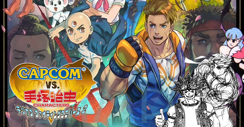
Capcom vs. Osamu Tezuka Characters
Despite the name, a large portion of the exhibit, and the majority of what will be discussed here, does not actually involve Tezuka at all. The actual “Capcom vs. Osamu Tezuka Characters” component refers to collaborative illustrations, merchandise, and decorations featured at the Toshima City Tokiwaso Manga Museum, a recreation of the communal living space shared by foundational manga artists including Osamu Tezuka, Fujiko Fujio, and Shotaro Ishinomori. For those with an interest in the pioneering manga artists of the 50s and 60s, it’s definitely a highly recommended visit, Capcom decorations or not.

The museum also featured a wall of special crossover illustrations by both Capcom-associated and Tezuka Productions artists, as well as a showcase of the history of both Tezuka and Capcom products.


For the rest of the exhibit, the “Tezuka” element is only in reference to the venue (though the material is actually split between the Manga Museum and the Showa Retro Museum a few blocks down). Here, Capcom has set up several exhibits featuring development materials, many of which have never been made public before, for their fighting games. These sections specifically did not allow photos, so I’m working entirely off of memory, and will provide any relevant images from public sources when available.
Street Fighter 6 Development Material

The section of the exhibit at the Tokiwaso Showa Retro Museum was primarily focused on Street Fighter 6. I expect that much of the material shown here will make it into a Street Fighter 6-focused book sometime in the future, so I’ll only lightly touch on it.
The exhibit featured a ton of design concepts for each of the currently released characters (up to Bison at the time of my visit, though I’m not sure if Terry has been added since), with an outline of the general path that their design process took to reach the final one. Returning characters’ redesign process generally had a good amount of freedom to them, though some, like Ryu and Ken, had more of a firm starting point than someone like Juri, whose initial design phase was completely freeform. Many of the new characters were designed without initially having an ethnicity or gender in mind (Kimberly in particular started with “just make a cool ninja design”). Overall, it’s all pretty familiar to anyone who has looked at the Street Fighter 5 design material, as the process was largely the same.
Beyond the character designs, the only other Street Fighter 6 design material shown was a storyboard for the Season 2 reveal trailer. The storyboard was fairly particular with how exactly Terry should be depicted prior to the full reveal.
Painting Gallery
The exhibit featured a small gallery of original paintings for Capcom’s fighting games. Beyond just recognizable pieces of key art, the gallery also included some lesser-known pieces such as calendar, drama CD, and anniversary illustrations. The majority of the contributions were from current or former Capcom artists like Akiman, Bengus, Edayan, and Sensei, but some notable external artists such as Yusuke Murata were also featured. The primary featured series were Street Fighter, Darkstalkers, Cyberbots, and Red Earth.


A few of the illustrations whose original paintings were on display (scanned from Capcom Design Works).
Having seen these illustrations in print and digital form countless times for years, it was easy to forget that these originally saw life as paint on canvas. Being able to make out the texture on the individual brush strokes of these landmark fighting game illustrations helped reinforce a level of artistry to them that even I occasionally forget to afford them.
The nature of the display did mean that Capcom artists who didn’t typically utilize acrylic paint in their work, like Kinu Nishimura, did not have any paintings featured in this section. Still, it was incredible to see that so many paintings from throughout Capcom’s fighting game legacy had been preserved for over 30 years, and felt like a testament to Capcom recognizing the artistic merit of the work of their employees.
Rival Schools Illustration Gallery

There is a rotating showcase for original art from a certain game, which was the Rival Schools series during my visit. Previously, it featured Street Fighter 3, and based on the other material present, the last one will likely be the Darkstalkers series.

The Rival Schools showcase featured an enormous amount of original lineart for Rival Schools, Seishun Nikki 2 and Project Justice all mixed together. All the character portrait art was present, as well as a lot of story art and some design concept sketches. I believe most of what was there had made it into the final game, but I’m not familiar with every illustration featured in the story modes. Most of the design concepts I recognized from elsewhere, though some, like Ran’s concept designs, were likely created for Seishun Nikki 2, and weren’t included in either Rival Schools or Project Justice design material collections in the past. There were also some full-color illustrations that were not by Edayan that I didn’t recognize, that seemed to be for trading cards, but I wasn’t able to find the source.
Street Fighter 3 Internal Pitches
The last section of this exhibit was a wall featuring three collections of never-before-public design documents. The first one was a collection of answers from an internal Capcom survey from the mid-90s (an exact year wasn’t given, but it was seemingly pre-Alpha) asking “if you were to make Street Fighter 3, what would it be like?”.
There were a lot of answers provided, all handwritten, so I can’t summarize them all, but I will try to cover some of the common points.
The decision to reboot the cast was an extremely popular one, with virtually no dissenting. It’s possible that this was an idea established before this survey was done, but the vast majority included rebooting the cast in their proposal, with most opting to keep only Ryu and Ken, though some would go even further and suggest even they were removed. A few voices sought a more crowd-pleasing direction for the roster, including integrating characters from other Capcom properties, or setting up for a Street Fighter 4 that would be a crossover of characters from 1-3.
An increased focus on visual spectacle and personality was another common point, including more dynamic stages or changes to the characters over the course of a fight. Seemingly, most surveyed were intent to stick with 2D, though the ones wanting to switch to 3D were quite bold about it.
On the actual mechanical level, feedback was much more mixed with what they wanted to see, though many pushed for more drastic changes in the direction of accessibility and differentiation. Some ideas included reducing the number of buttons to 3, removing special moves, using a touch panel for inputs, or even allowing characters to fully move around on multi-planed environments (much like Namco’s Outfoxies).
How much any of this actually went on to influence the final product is unknown, but at the very least, many of the most common sentiments did see it through.
Rival Schools Early Design Document
Next, there was an early design document for the original Rival Schools.
Most of the grander ambitions for the title were locked in from the start and remained unchanged. The game was always 2v2, with the partner character used for Team Up attacks. The gameplay was always intended to focus on non-stop action, with chain combos, launchers, aerial raves, and guard cancels. A mock-UI was also shown, which was fairly similar to the final one. The main difference in the gameplay from the final product was a much less dynamic camera system compared to what was originally pitched.
Aesthetically, the game sought to one-up Star Gladiator in providing smooth 60fps gameplay with higher fidelity models and much higher resolution textures. The game also sought to attract players with a focus on story told through in-game illustrations, as well as a roster packed with female characters.
The design document also included the full roster, which was strikingly similar to the final one, albeit with some notable changes.


The biggest difference is the 3 protagonists from Taiyo High, who were completely different than the final version. The main protagonist was a much more standard cheery shounen protagonist, while the secondary male lead was a character who would later be split into Batsu and Kyosuke. Rounding out the team was Sakura herself, who was not only planned for the game from the start, but was originally the female lead, with Hinata nowhere to be seen.


Gorin High featured Shoma and a volleyball player with passing resemblance to Natsu (I don’t recall if gender was specified), but also included Nagare, looking nearly identical to his design for when he would debut in the following game. According to other design material, Roberto being swapped in happened at the very end of settling the roster.

Gedo High’s roster was the same, though Edge had a much more reserved design (Akira was always planned to secretly be a girl). Pacific High was essentially identical, with no real differences I could spot, as were the Justice High School staff (Hideo was famously designed by Akiman in one go). Hyo was not present, but there was a note that time permitting, they wanted to add one extra bonus boss, who was the actual puppet master behind the scenes, noting that they could be a character who appeals to girls.
All scans in this section are from Gamest Extra No. 213 – Shiritsu Justice Gakuen Nekketsu Taizen.
Morrigan Early Moveset Document
Lastly, the full original design sheet for Morrigan’s moves from the original Darkstalkers was present. At this time, she was just referred to as Vampire Oneesan or “female vampire” in contrast to Demitri’s “male vampire”.

Though there’s a lot of resemblance to the final version, there are a few key differences, which indicate an overall directional shift for the game that took place since this was drawn. Morrigan’s basic animations, including her idle, walks, and jumps are quite similar to what we got, playing her up as a flirty character in a cute way, rather than a sultry one. Seemingly she was originally intended to have an aura around her like Demitri did, albeit a smaller one.
Many of her normals seem similar at first glance to how they would end up in the final game, but they almost all exclude the body-morphing element, having her attack with limbs or wings as is, rather than having them turn into different shapes.
Her special moves are almost entirely different, with the exception of a basic projectile, although even that took the form of a beam rather than a fireball. Shadow Blade and Vector Drain are completely absent, with her instead having a rush attack in which she turns into a bat, and a charge where she will pin her opponent to the wall. Her aerial special was a multi-hit thrust attack like Chun-Li’s kicks or Honda’s hands instead of Shell Kick. EX moves and Super Moves were completely absent from the list, so it’s possible they were not part of the game’s design plans at the time.
Though the hit and knockdown animations still maintained a level of lightheartedness, it took the form of cheeky breast jiggles rather than the series’ signature gag-style wild takes or other exaggerated expressions, which were completely absent. Her win and lose animations also were completely different, indicating more of an innocent flirtiness than the more confident Morrigan who appears in the final game.
While I was overjoyed to be able to see these design materials firsthand after nearly 30 years of secrecy, and I highly recommend anyone who is able to visit this showcase, I can only hope that someday, they will all no longer be exclusive to the limited number of fans who can attend a time-limited exhibit in Japan. Within the past few years, SNK released a book that contained dozens of pages of never-before-seen design documents, showing that it’s never too late to share more of the company’s history. I can only hope that in time, Capcom will follow suit.